Last year I had an opportunity to work with Peter Jones on a ground breaking book about approaching health care with a human-centered design approach. Many of the methodologies introduced new tools and techniques that would easily improve the lives of patients, allowing them more participation and better interactions with their caregivers and doctors. The book I am referring to is called Design For Care – Innovating Healthcare Experience by Peter H. Jones.

If healthcare institutions wish to evolve, the delivery of improved health care will have to focus on more innovative patient experiences that are more empathetic and more easily understood by the patients. This book makes a case for a systematic introduction of design thinking to challenge complex issues that move health care beyond its current limitations. Dr. Jones prioritizes personal life changing medical concerns for the average patient over that of the systematic business decisions of an institution and essentially gives both the patient and the institution a brighter lease on life. ‘Design For Care’, not only champions the patient but also offers reason to improve tools and techniques for health care institutions in order that they become more lucrative with a higher rate of successful life outcomes.
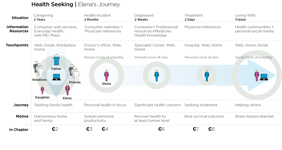
Of course, healthcare problems are complex, some are even termed to be ‘wicked problems’ and the solutions require systemic, human-centered design methodologies and knowledge based around a holistic view of treatment. Different people with different skill sets and methodologies are best used with an understanding that every problem has a different solution set. ‘Design For Care’ follows a fictitious patient, Elena, as she navigates the complex healthcare system. Along with her family and friends she starts her health seeking journey with multiple clinical encounters that will shape her healthcare experience and ultimately her health outcome.
My contribution
Peter and I connected at the early stages of his writing the book.
Published by Rosenfeld Media who “connect people interested in designing better user experiences with the best expertise available—in the formats that make the most sense, and in ways that demonstrate the value of UX.”, Peter wanted his book to be a game changer for Rosenfeld Media. He wanted it to be a breakout book that established a greater level of professionalism and authority.
Book redesign
We sat down and I took a visual inventory of their previously published books. Mostly visually stuck in the 80’s at that time, it was clear that although the various books by Rosenfeld communicated effectively with their printed copy in paragraphs, their page, chart and diagram formats were difficult to read and ironically did not communicate effectively. However what was more striking was the fact that many of the diagrams in the books were shrunk so severely onto a page that they were essentially unreadable. From a very few previously published books it was clear what had to change.
Fortunately Rosenfeld was exceedingly receptive to change. In fact they already knew they were a bit dated and really took the initiative to modify their approach and redesign their book designs, from the jackets on down to picking new typefaces that are clearer when printed at small sizes.
Information overload
A main task was to try and collect all the different pieces of visual information that might have appeared in the book. There were many different sources, formats, dimensions, and complexities in the visuals. But I knew Peter wanted his book to read like a single cohesive information source, so we decided that all the graphics, charts and diagrams, etc., would have to be redesigned from scratch to be more easily read as a single authoritative voice. The trick here was, that no matter how complex the graphic, it would have to be readable on a page size of only 4” x 7” (there was also a half page size). In order to accomplish this goal and to have the same point size of line width and typeface size I embarked on a process that would commit my time to producing/reproducing about 87 information graphics that would all fit into the 4” x 7” space. In the end this was far more difficult than I thought it was going to be, the reason was that some graphics were information sparse and some could have filled a tabloid size sheet. But to keep the design language consistent I had to challenge Peter on a few.
Parsing down the information
Peter is quite the intellectual, he remembers everything and everything in fastidious detail. Unfortunately explaining 25 things through a diagram just because it can be done doesn’t necessarily make it a good choice for a relatively small footprint. So some of the visuals had to be rethought. It wasn’t really a question of if they were correct, it was more the nature of what was absolutely necessary and pertinent to the argument of the chapter. Sometimes changing the visuals’ content also meant that it influenced the chapter copy. This process I found particularly difficult. It seems that once people have information in front of them, and even though it is not directly pertinent to the argument being made, it is difficult to parse it down. In this particular case some graphics were harder than others to agree upon, but not only did the conversations help me understand the importance of each graphic, they also helped Peter frame the chapter arguments.
Irony at the publishing stage
After all the diligent care to ensure graphical consistency, in the end the Rosenfeld Media book layout person/team shrunk or enlarged most of the graphics to fit some semblance of what they deemed important to the layout. Unfortunately this meant that that by the time the book was printed that “0.5 point line width” ended up being 0.315 on one page and 0.263 on another. Not to mention the typeface sizes that are now all over the map instead of a consistent 7 and 9 point.
After my first look at the final printed book I tried to explain that this was the design mistake equivalency of each chapter of the book having a different typeface size… which of course would look unprofessional. Sigh…
Many ‘A ha’ moments
Regardless, this book is a must read for anyone (everyone) who has ever been on the receiving end of medical care; sat in an office, confused by the procedures and general lack of communication and thought to themselves “It would be much easier if …” For those of you who had the audacity to speak up, to ask questions about institutional procedure or apparent lack of communication, or even give a suggestion on making the institution friendlier, this book will let you know that you are not alone.
Thanks to Peter
I enjoyed working on this book with Peter. It was refreshing to develop new thought on a subject matter that will hopefully help something as important as improved patient healthcare to gain the traction it needs.