I have never included anyone else’s thoughts on 418QE before but after reading my very good friend and mentor Keith Branscombe’s rant, I could hardly resist. I asked him if I could publish it. His ‘rant’ makes some obviously valid points and it is certainly food for thought – enjoy!

Keith’s preface: “The flood of 30th anniversary comment regards this document, made me realize just how wretched looking the actual document is! And I know it is what it is and we are stuck with a tacky image, but only had they asked…”
A layout & design critique
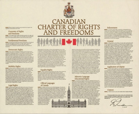
The pathetic design/typography of our most historic of Canadian documents
Boring Symmetry
Symmetry is a layout strategy loved by committees it offers an outcome that no one can quibble with, a guaranteed perfect balance.
Humane Silhouettes
The use of clip art as a design element is the most troubling. A sadly naive attempt to “dress up” the document, has resulted in lowering its tone. The insertion of humane silhouettes is the ultimate cheapening of the message. They so succinctly capture hackneyed thinking. “Now let’s see, from the left we have a male holding something, on his right we’ll put a female (note skirt) then beside her a youth, male I think, then his mom, an older woman (she’s wearing dress and she’s heavier…), then a hockey player. What an inspired choice!” Really so totally Canadian!) etc.

The Typeface
Carl Dair’s “Cartier” type was commissioned and released for Canada’s 1967 centenary celebrations. This alone would make it an easy choice – but wait there is more! The face was named after the great French explorer Jacques Cartier. So Canadian, eh? Perhaps a more suitable name should have been Carldair! The late Carl Dair was one of Canada’s most talented graphic designers, he died in 1967 at a young 55 years. In his design for the Cartier typeface, his love of lettering shows through, perhaps too much so, I think Cartier suffers for its mannered hand-lettered look.
The charter’s upper case title needs extra spacing between the lines. A little more air would display these six words with an ‘uncrowded’ elegance. But the body text of the Charter is overly kerned (set too tightly and not enough space between the individual letters within words) and the space between the words needs to open up as well. Perhaps using a different type face for body text would have been a better solution.
Other Graphic Elements
Our poor flag so jammed into the clip art crowd it can hardly breathe, flags need air, this Maple Leaf is suffocating. With our Coat of Arms and our flag do we also need the House of Parliament? I say delete the ‘HP sauce’ engraving at the bottom use the space gained to enhance the readability of the text with a little extra leading. Some might say “Oh Keith stop complaining!”, they could have set the entire document in Times Roman or heaven forbid, the ubiquitous Helvetica! But all kidding aside, Times would have been a better choice for the text.
My “Non-withstanding Clause”
To avoid future visual embarrassment when historic documents are required to be drawn the Feds should consult visual professionals. Had they asked The Society of Graphic Designers of Canada, (their office is in Ottawa) the clip art would surely have been clipped.
– Keith Branscombe, Toronto, April, 2012
Comments
One response to “A layout and design critique”
Too funny and so true.