My good friend Keith Branscombe is at it again. A couple of days ago he sent me a beautiful rant about the Canadian Government and its lack of thinking when it comes to branding our national image. This time it is about the new paint job on the Prime Minister’s military Airbus jet, the Polaris CC-150. He has graciously allowed me to publish it. Enjoy!
![]()
Keith’s question: What design?
At first look I was reminded of the graphic style adopted by city police departments. The squad cars with swoosh-like graphics and hideous lettering that are ubiquitous throughout North America — a style most favored by adolescent males, and the manufactures of RVs. NDP leader, Thomas Mulcair said “The colors of the plane, the whole detailing, are clearly patterned on the Conservative party.” and he is dead right. It references those relentlessly airing ads that claim to “Inform Canadians” but are promoting the Tory brand on our nickel.
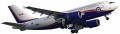

The military say the design was done in-house by a graphic designer in the air force. I would like to learn more of this “in-house artist” who designed the livery for Air Harper. What did the briefing say? Who is he or she? How long have they been working professionally as a graphic designer? Where did they study design? What do they say in defense of their work?
What does The Society of Graphic Designers of Canada have to say about this?
As a design professional I say this paint job is sub-standard, and the RCAF should have consulted a design pro for such an important visual a representation of our country. And what’s with the Tory blue? Last time I looked our flag was red and white.
Compare RCAF to USA had Raymond Loewy design livery for AF#1
The U.S. Air Force had attempted a special presidential livery of their own design: a scheme in red and metallic gold, but JFK felt the aircraft appeared too regal so he sought his wife’s advice and Jackie contacted the French-born American industrial designer Raymond Loewy for help in designing a new livery, his earliest research took him to the National Archives, where he looked at the first printed copy of the U.S. Declaration of Independence, and saw the country’s name set widely spaced in Caslon capital letters. He chose to expose the polished aluminum fuselage on the bottom side, and used two blues; a slate-blue associated with the early republic and the presidency, and a more contemporary cyan to represent the present and future. The presidential seal was added to both sides near the nose, an American flag was painted on the tail, and the sides of the aircraft read “United States of America” in classic Roman capital letters. – from Wikipedia history of “Air Force 1” livery design.
You be the judge
Of course everyone will have their own opinion but perhaps it could be focused on the quality of the work instead of one’s political leanings. While I agree that the American’s did it better than us again and acknowledging the fact that our new Canadian design leaves a lot to be desired, I don’t believe that the blue was necessarily a “conservative” one, as the RCAF has always had it. But unfortunately, in the end, it is another lost opportunity.
As a postscript you can find Keith’s comments in the Globe and Mail.
Comments
2 responses to “Another federal design disaster”
Great critique, I wonder if the designer(s) who took the job realized how much of a political firestorm his/her/their design would cause? For the most part I agree with Keith.
Just saw your tweet, I am looking forward to the rebuttal.